
In fact, the problem of low sales may lie in many aspects of your business – poor SEO, high prices, narrow product range, etc. However, don’t underestimate the importance of your website.
If you notice that the conversion going from the ad to the site is high, while the site itself is dropping sharply, you can’t doubt where the problem lies. It could be that the site hasn’t quite “perfected” the offer that lured the user in the ad, or the site is difficult to navigate, unreadable and irritating to the viewer. It’s worth critically examining all elements of your site to find the troublesome and ineffective ones. Here are some things you should pay attention to first and work on them if possible.
If your website is unreadable, complicated, or doesn’t display properly, a potential customer will quickly close it. If a user has difficulty finding a product in the catalog or filters – they can’t buy it. If the sub-pages of your store do not clearly answer the user’s questions: “Where am I?”, “What do they offer me here?” and “Do I need this?”, it means that they are not useful for him. Not understanding the logic of your site, the consumer will simply go to competitors who have simpler and more readable sites. Therefore, when designing an online store, be guided not only by your taste, but also by the requirements and expectations of your audience.

Use tried and tested solutions, without unnecessary complications. Navigating the site should be pleasant, intuitive and easy, and searching for products should be efficient and effective. It is worth taking care of the responsiveness of the site, checking the loading time of individual subpages and optimizing it, as well as adjusting the site for viewing on mobile devices. The fact is that more and more users use tablets and smartphones for shopping, so you need to make sure that your website works on them efficiently and without errors.
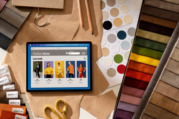
A product card page is often set up with contextual or targeted ads, which means it’s the first and most important thing a user sees on your site. A good product card includes:
Customers like to know what they are buying. Growing consumer awareness makes them have a lot of questions before buying, and lack of specific answers can effectively discourage them. Therefore, create a clear page for each product. Take into account all the questions the user may have and answer them – put the appropriate product specifications on the page. The more information you provide, the more willing the consumer will be to buy it.
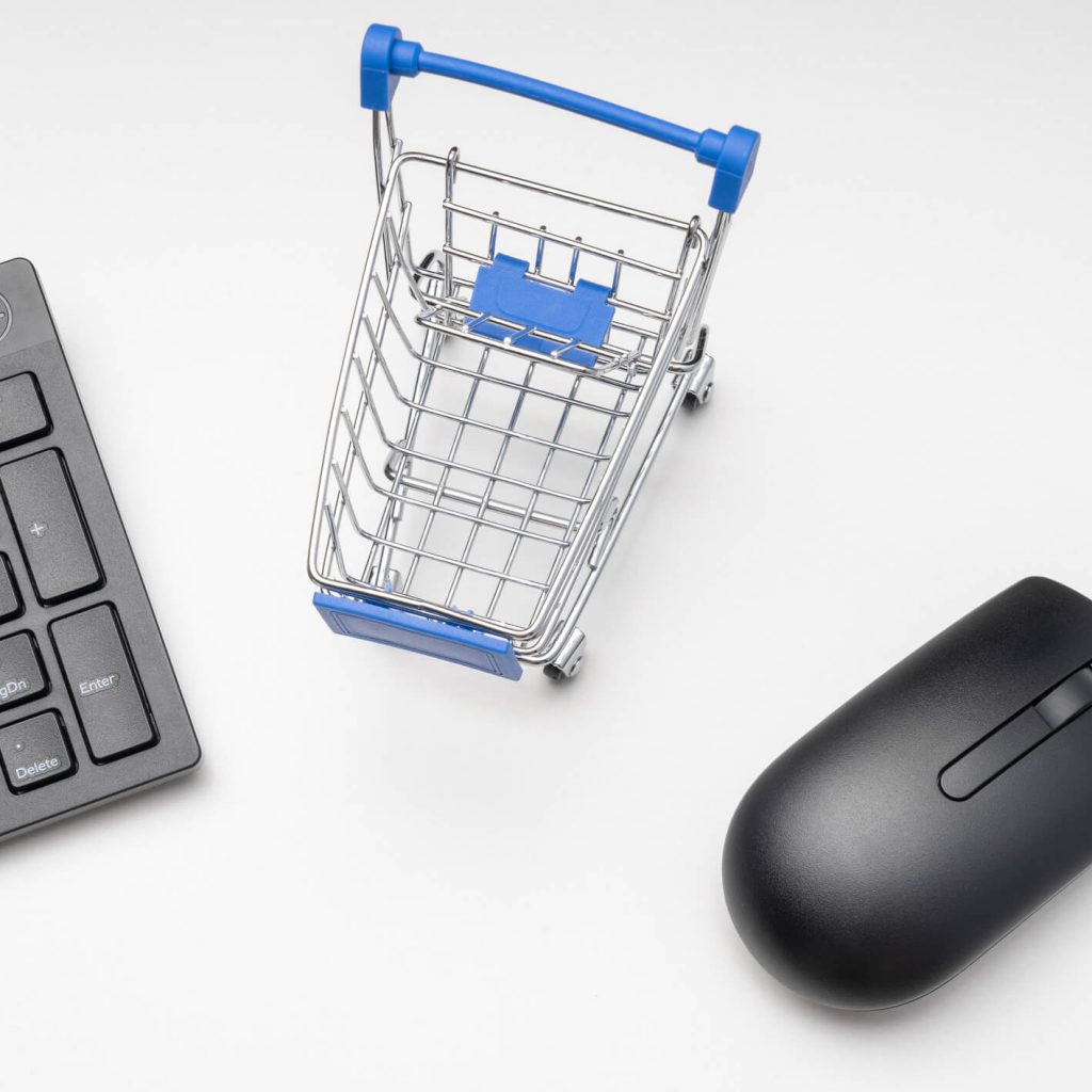
ReadyCloud research shows that globally, on average, about 75% of users abandon their shopping cart for reasons such as:
Therefore, pay attention to how the shopping cart looks on your site and whether it has all the necessary elements:
The shopping cart is not yet an order processing and order payment, which means that there is a chance to increase sales. Try adding a box with other items that may be of interest to the customer.
Design the shopping cart as a modal window rather than a separate page. This will make it easier for the user to return to the catalog and continue shopping.
The stage where online stores make it difficult for customers to shop, and thus discourage them, is usually the order placement. Typical mistakes:

When it comes to payment and delivery methods, it’s a good idea to make them as diverse as possible to meet customer expectations. The report of the Chamber of Electronic Commerce shows that the most popular payment methods are traditional bank transfers, quick transfers through appropriate services, payment on delivery, and payment by card.
In case of delivery, recently the most popular are parcel machines, as well as pick-up points in local Żabki and kiosks – they are usually cheaper than courier and give the possibility to choose the place of delivery convenient for the customer. However, it is advisable to offer several different delivery options and include an estimated delivery time with each one.
You need to make it easy for users to communicate with you, especially when they have questions about your goods or delivery and payment terms. Your contact information should be easily traceable, visible, and above all, up-to-date. Don’t give out a number or email that you don’t use. It can also be a good idea to use a chat box where the customer can talk to a consultant.
Working on the usability and conversion of your website is about creating a version of it where the user will feel comfortable and which will not discourage them from making a purchase. Make sure that the design of your store is as friendly to consumers as possible, builds their trust and promotes a positive experience. Try testing different solutions on your site and find the optimal and effective ones.